Graphical Comparison
It's been a while since I mentionned that graphical comparison with EMF Compare 2 was coming. Well, the feature has been included as a preview in the M5 milestone of EMF Compare (which can be installed from this update site). We can now properly detect and merge graphical differences in GMF models.
However, we have now initiated a more thorough reflection on how to display these graphical differences. Our preliminary implementation is not satisfactory:
Should we use a custom color code or reuse the "team" colors (those that show on the icon's overlays), should be draw a rectangle "around" the differences or decorate the existing figure's borders, how can we best show that an element has been deleted?
We are trying to determine how these differences would be best displayed... and your opinion matters :). If you think you can help on this reflection, or wish to share any thought on this point, the specification of what we expect the graphical display to look like can be found on the wiki. We've initiated a thread on the compare forum for the discussion to take place for anyone interested.
Two special integration features for Papyrus and Ecoretools are also contributed, though these only include means to detect "label" differences and may be temporary: labels are computed when displayed, potentially from many distinct other features... thus detecting and merging them is very costly. For the technical, we have to create off-screen editparts and compare the labels textually. Merging requires calls to the direct edit tool when there is one. These integration features may not be kept in the final release.
User Interface
The second most visible change that's coming with this M5 milestone of EMF Compare is a deep modification of how differences are displayed in the structural view. In short, we previously had a very long sentence that tried to describe the changes in details:
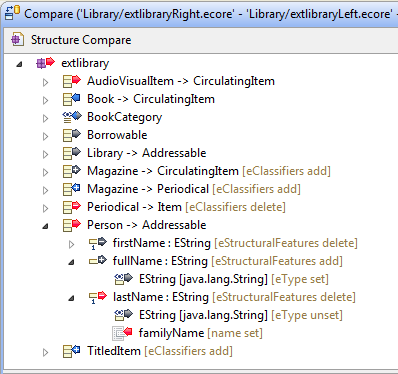
While we have reduced this to the bare minimum useful information with this new version:
We expect that the simple label, along with the change icon (remote, local, conflict...), will be enough to understand what happened in the model. We add the name of the feature that actually changed along with the type of difference we detected as additional information.
The content viewers (the two/three panes displayed as the bottom half of the comparison editor) are also expected to change before Kepler is live. Namely, we are currently changing the way we show the differences in their context. Currently, the only context we offer is the list of siblings of the changed element:
For containment changes, this is quite disturbing, and we are changing that to display the whole tree instead (along with the other containment changes detected during this comparison:
Extensibility
EMF Compare is thought and implemented as a framework, and we are striving to provide all extensibility means that could be necessary to tweak, customize or replace the comparison and merging processes. I won't go in much detail here, more information on each possibility will be added to the wiki, or questions can be asked on the forum.
- Customize the comparison process: Most steps of the comparison process can be modified, be it the matching, differencing, detection of equivalences, detection of conflicts, resolution of the logical model...
- Custom mergers: We now provide an extensible merging framework so that extenders (or users) can alter the default behavior or contribute their own merging policy for either default or custom differences.
- Filtering or grouping differences: Differences displayed in the structural view can be filtered and/or grouped together. A number of default options are provided, but new ones can be added seamlessly through extension points.
- Customized user interface: There are a number of entry points to customize the user interface of EMF Compare. For example, the graphical comparison we were discussing above is entirely contributed to the EMF Compare UI as an extension. Clients can also tweak the labels and icons of the differences, contribute new toolbar actions, ... This is a part that still lacks good documentation, feel free to get in touch through the forum if you need more details on this.


No comments:
Post a Comment