Monday, June 3, 2013

EMF Compare - GMF strikes back

Here we are, EMF Compare 2.1.0 is just around the corner. This was a very exciting, yet very busy year. EMF Compare 2.0 was released last summer, laying out the foundations for all of the cool stuff we wanted to (but could not) include. Now, 2.1.0 comes to fill the gap between the 1.* and 2.* streams, most notably through the re-introduction of support for graphical comparisons.

So what can you really expect from Compare 2.1? Let's skip the project life and focus on the cool features that can now be used.

Graphical Comparison

We introduced a "preview" support of the graphical display of differences into the project in its fifth milestone (M5) back in february. This was one of the biggest features we wanted to polish for the release, and polished it has been :).

This support is quite generic, and it should be able to handle most GMF-based modelers without too much work from their side (a few extensions are needed to tell EMF Compare how to open their diagrams). For now, our primary target was Papyrus.

Though the differences themselves were all pretty well detected, we were not happy with how they were displayed in this first draft. The decorators we use to tell the users "what changed in there?" were thus our primary focus. Here are a few examples of the differences that can be detected in Papyrus UML diagrams... and how we display them in said diagrams.
  • Adding a Class
    Both "new" and "old" models are displayed, on the left and right sides respectively. The Class "A" has been added : it is highlighted in the left (new) diagram, and a transparent placeholder for its shape is shown over the right (old) diagram.
  • Removing a feature
    Within lists, the placeholder is shown as a single line:
  • And if we need some context to understand the change?
    Some changes cannot be understood if shown alone. For example, cascading differences (delete a package and all of its content) need some context to understand the differences related to said "content". Likewise, if we delete both sides of an association along with the association itself, we'll need contextual information to understand the association difference. This is handled through lighter-colored placeholders.

  • What about conflicts?
    In case of conflicts, we try and highlight all related information on all three sides of the comparison:
Comparing models without identifiers

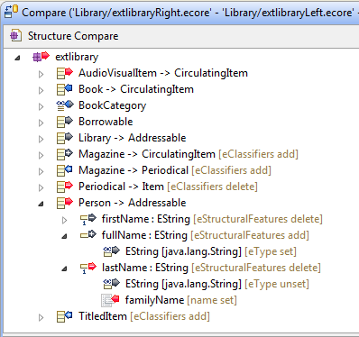
One of the hardest part of comparing EMF models is that we need to "match" the elements contained by these models together. When we are given two instances of a given model in two different versions, we need a way to tell that some package "library" in the first version is the same element as the package "library" in the second version. Likewise, we need to be able to tell that the attribute "pages" of a class "Book" in the first is the same as the attribute "length" of the class "Book" in the second version before we can even tell that there is a difference on that attribute (it has been renamed).

When we have identifiers in our model, this is an easy matter. We assume that the identifier of one given object has not changed between the two versions. However, this is not always (rarely, in fact) the case. EMF Compare 2.1.0 re-introduces support for such models, computing and matching objects through their similarity. For example, here is the result of comparing two ecore files together:
Enhanced user experience

The amout of data we compute is quite large, reflecting the accuracy we desire for the comparison; and the number of differences between two versions of the same model can be daunting. We strived to improve the comparison UI in order to provide a much more precise and intelligible information. We've used two means to that end, both of which can be extended by clients of the API.
  • Grouping differences together
    By default, EMF Compare does not group differences, and simply displays them as they've been detected:
    One of the options we provide by default lets you group these differences according to their originating side (in the case of three-way comparisons, comparing with a remotely controlled version for example), along with a special group for the conflicts (if any):
  • Filtering differences out of the view
    A second option (of course, both can be combined) to limit the number of visible information is to filter out differences that could be considered somewhat as "noise". For example, EMF Compare detects all differences within the containment tree: if the Class "Book" has been removed, then of course its attribute "pages" has been removed. And in turn, the "type" of this attribute has been unset. Those are three differences resulting from a single one. By default, EMF Compare will not display the "resulting" differences, focusing on the "root" only:
    However, they are still computed, and they are still there in the comparison. We called these "cascading" differences, and users can choose to have them displayed instead by unticking the associated filter:

This has already become too long of a post (kudos if you read all the way till here ;)). Anyone interested in the full list of enhancements and highlights of this release can find it here on the project's wiki, with a little more details.

Thursday, February 14, 2013

EMF and Graphical comparison - what's in the pipeline?

A lot of things are being worked on for EMF Compare, and while we're polishing the core and refining the user-interface, a few new features have been included in the latest milestones. The biggest focus is on the graphical (GMF) comparison and displaying of differences:

Graphical Comparison

It's been a while since I mentionned that graphical comparison with EMF Compare 2 was coming. Well, the feature has been included as a preview in the M5 milestone of EMF Compare (which can be installed from this update site). We can now properly detect and merge graphical differences in GMF models.

However, we have now initiated a more thorough reflection on how to display these graphical differences. Our preliminary implementation is not satisfactory:
Should we use a custom color code or reuse the "team" colors (those that show on the icon's overlays), should be draw a rectangle "around" the differences or decorate the existing figure's borders, how can we best show that an element has been deleted?

We are trying to determine how these differences would be best displayed... and your opinion matters :). If you think you can help on this reflection, or wish to share any thought on this point, the specification of what we expect the graphical display to look like can be found on the wiki. We've initiated a thread on the compare forum for the discussion to take place for anyone interested.

Two special integration features for Papyrus and Ecoretools are also contributed, though these only include means to detect "label" differences and may be temporary: labels are computed when displayed, potentially from many distinct other features... thus detecting and merging them is very costly. For the technical, we have to create off-screen editparts and compare the labels textually. Merging requires calls to the direct edit tool when there is one. These integration features may not be kept in the final release.

User Interface

The second most visible change that's coming with this M5 milestone of EMF Compare is a deep modification of how differences are displayed in the structural view. In short, we previously had a very long sentence that tried to describe the changes in details:
While we have reduced this to the bare minimum useful information with this new version:
We expect that the simple label, along with the change icon (remote, local, conflict...), will be enough to understand what happened in the model. We add the name of the feature that actually changed along with the type of difference we detected as additional information.

The content viewers (the two/three panes displayed as the bottom half of the comparison editor) are also expected to change before Kepler is live. Namely, we are currently changing the way we show the differences in their context. Currently, the only context we offer is the list of siblings of the changed element:
For containment changes, this is quite disturbing, and we are changing that to display the whole tree instead (along with the other containment changes detected during this comparison:


Extensibility

EMF Compare is thought and implemented as a framework, and we are striving to provide all extensibility means that could be necessary to tweak, customize or replace the comparison and merging processes. I won't go in much detail here, more information on each possibility will be added to the wiki, or questions can be asked on the forum.
  • Customize the comparison process: Most steps of the comparison process can be modified, be it the matching, differencing, detection of equivalences, detection of conflicts, resolution of the logical model...
  • Custom mergers: We now provide an extensible merging framework so that extenders (or users) can alter the default behavior or contribute their own merging policy for either default or custom differences.
  • Filtering or grouping differences: Differences displayed in the structural view can be filtered and/or grouped together. A number of default options are provided, but new ones can be added seamlessly through extension points.
  • Customized user interface: There are a number of entry points to customize the user interface of EMF Compare. For example, the graphical comparison we were discussing above is entirely contributed to the EMF Compare UI as an extension. Clients can also tweak the labels and icons of the differences, contribute new toolbar actions, ... This is a part that still lacks good documentation, feel free to get in touch through the forum if you need more details on this.